Why I redesigned my personal website
Actually, I can answer it in one sentence. I wanted my website to be useful.
But here are more details if you're curious.
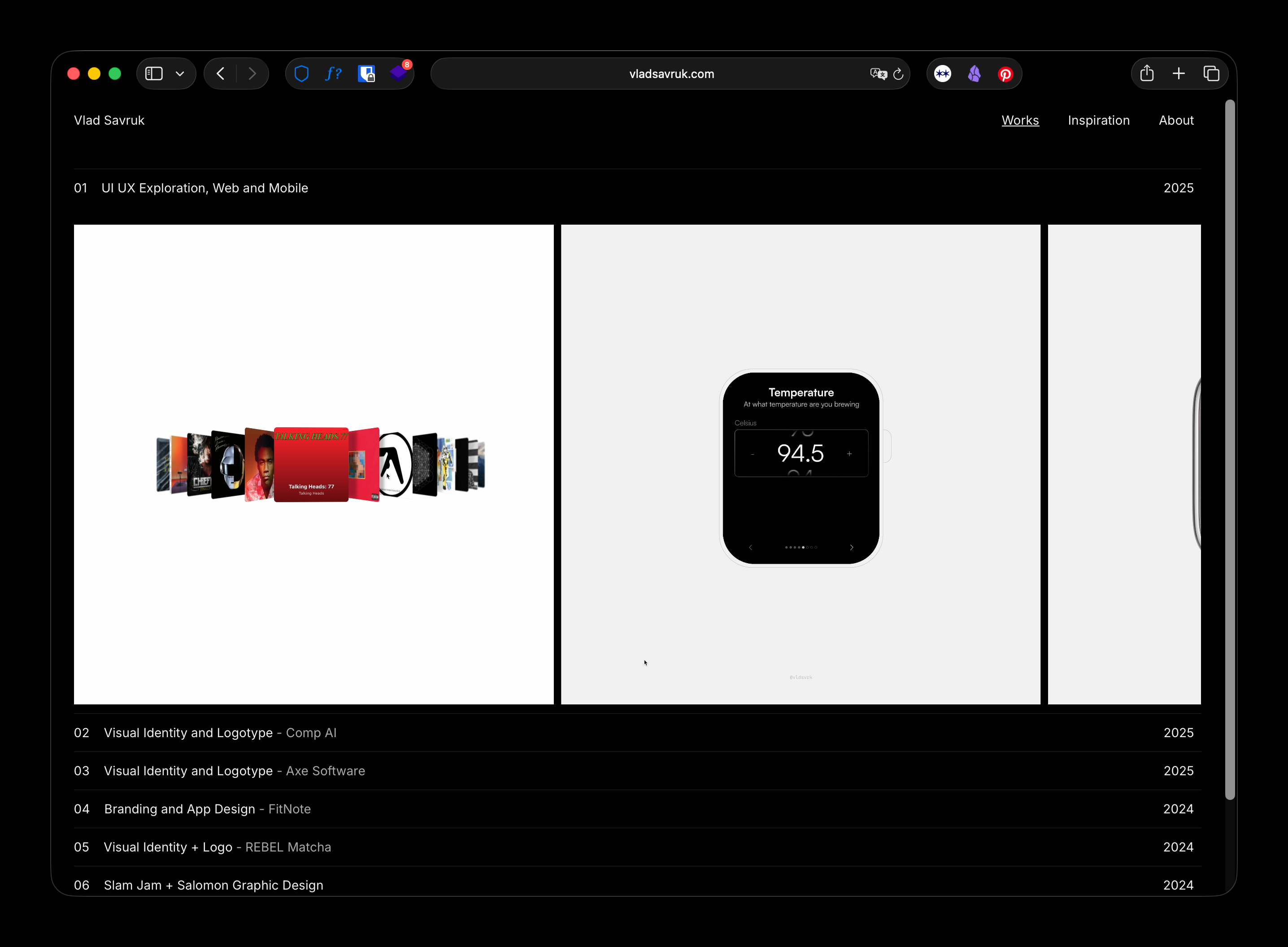
When I designed the previous version of my website, my focus was on showcasing my work. I wanted it to be fast, functional, pretty and client focused. Because of that, the decisions I made at the time were:
- My home page is my work; it's the centre stage.
- Giving space to media and having an option for detailed descriptions as well.
- Information about me is secondary.
It was designed a year ago, and since then my work has evolved and my priorities have shifted. As I said before, one of the requirements for the new website is to be useful, meaning designer focused. And I can achieve this by sharing my writing, notes, and being transparent as a designer, as I hope that people can learn from it. Therefore, here are some new decisions that I made to help me achieve this:
- The content and I come first.
- A simple system built around Obsidian for the publishing workflow.
- UI and visuals that put the content of the blog in a higher place.
- A new navigation system for quick navigation between pages.
- More modular architecture that will help me quickly add new things as I want.
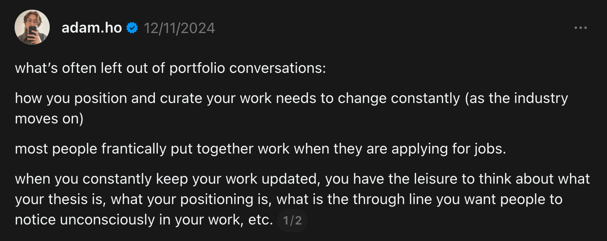
I want to share this post from Adam Ho that I agree with. But what I would also add is that you as a person and a designer evolve. And for e.g. I personally often find myself not relating to some statements that I made before.